

When I started to learn reactjs I was always jumping and trying out new component libraries from material UI to tailwind I tried most of them. I was always a fanboy of material UI but lately, tailwind got over it. The reason is oblivious that a developer can easily identify if a web app has used material UI or not but not in case of tailwind we get more customization and faster results.

So coming to the point I always wanted to create my own react component library and I know some of you may had this same desire. So let's fulfill it.
Let's understand a few terms here: What is Storybook?
So it is an open-source tool that helps in building the UI components. It not only helps in the building process but also makes the documentation and testing process way more efficient and easier for everyone.
Once we create any component let say button, Storybook lets you create a "story" file where you can import and create various versions of it.
Creating a React app
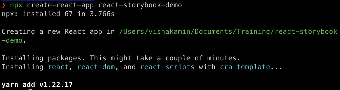
To get started let's create an app using CRA.
npx create-react-app react-storybook-demo
After creating it move into your app.
cd react-storybook-demo
Installing Storybook
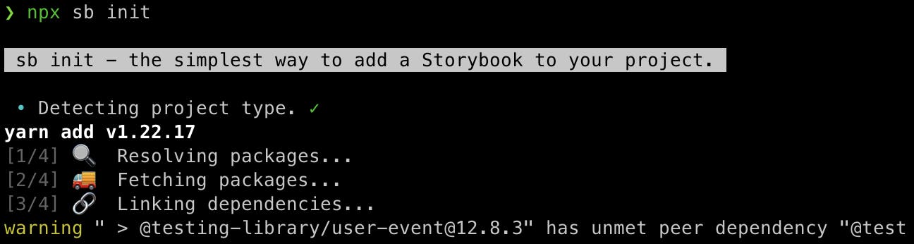
Install the required libraries by running the command
npx sb init
After the installation is done we can Start up the Storybook
yarn storybook
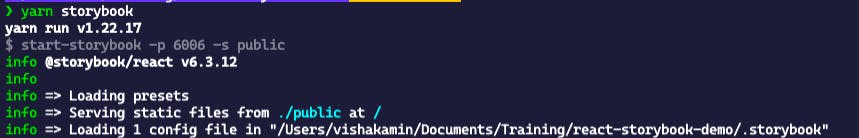
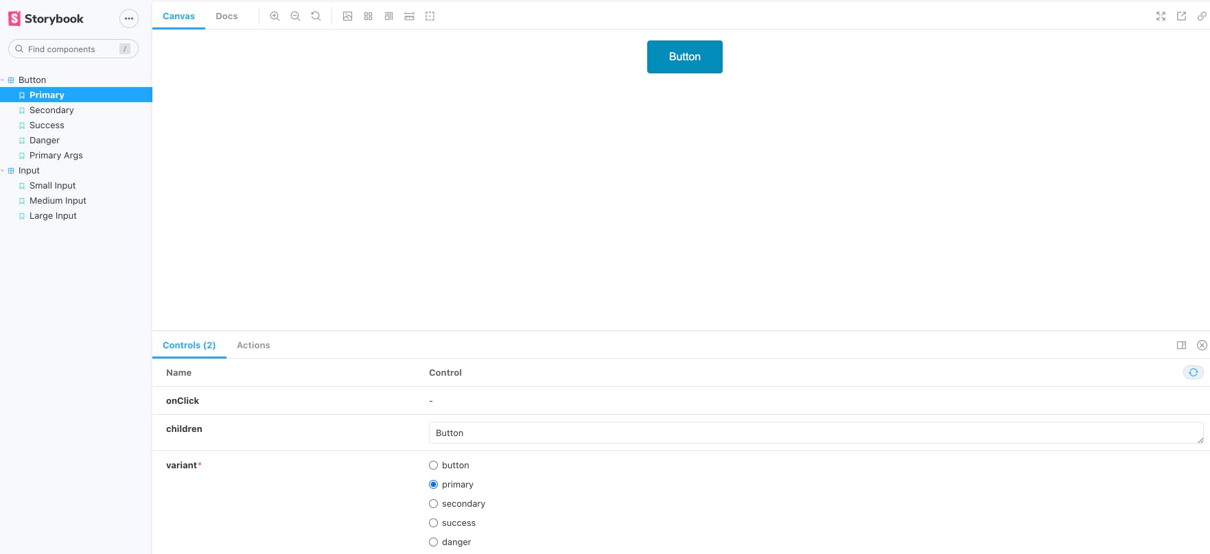
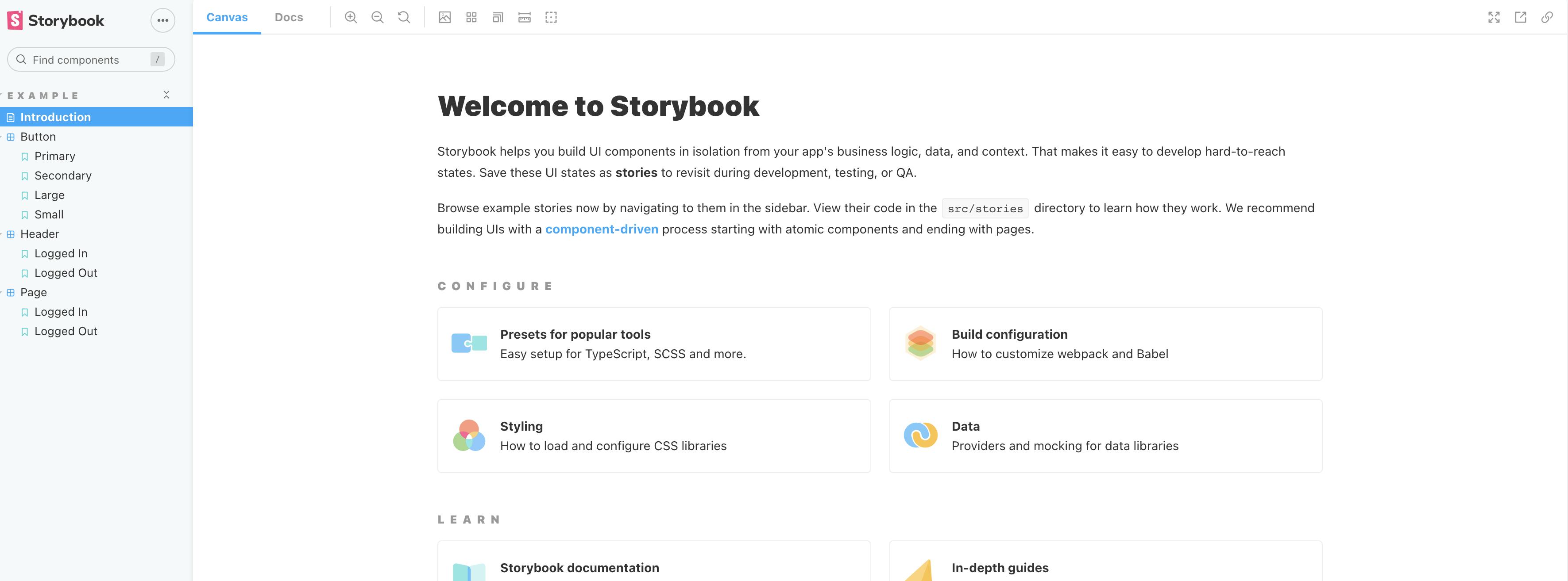
Once the loading is done it will open a new tab on the browser where you can see your storybook dashboard
Creating the component
If you see the storybook dashboard it already comes with some buttons etc which is great but not for us who are learning it. Let's go ahead and delete the stories folder present inside src.
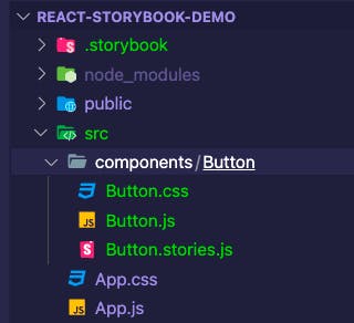
Now create a folder called "component" inside the src folder.
To keep it simple we will create only the Button component but you can create n number of components as per your design.
So create a Button folder inside the component and create 3 files namely
- Button.js
- Button.css
- Button.stories.js
So it will look something like this
Now let's create a simple button in the Button.js file
import React from 'react';

const Button = (props) => {
  const {variant = "primary", children, ...rest} = props
  return (
    <button className={`${variant} button`} {...rest}>
      {children}
    </button>
  )
}

export default Button
Here we have created a button component, we are also destructing the props and using the className, and spreading the rest of the props in the rest variable.
We have to style the button as well so I will share the CSS code which you can paste in the Button.css file.
.button {
    border: none;
    color: white;
    padding: 15px 32px;
    text-align: center;
    text-decoration: none;
    display: inline-block;
    font-size: 16px;
    border-radius: 4px;
    cursor: pointer;
  }

  .primary {
      background-color: #008CBA;
    }

  .secondary {
      background-color: #e7e7e7; color: black;
    }
  .success {
      background-color: #4CAF50;
    }

  .danger {
      background-color: #f44336;
    }
Creating the stories
So now we have the button component ready let create the story in the Button.stories.js
import React from 'react'
import Button from './Button'
export default {
title: "Button",
component: Button,
args :{
children : "Button"
}
}
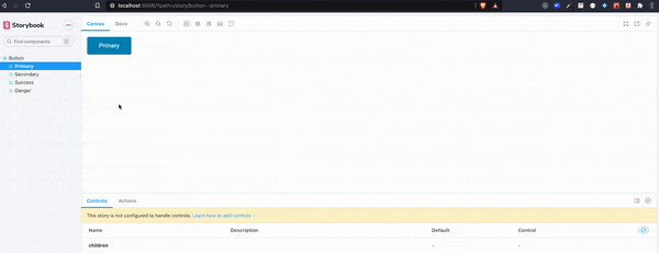
export const Primary = () => <Button variant="primary">Primary</Button>
export const Secondary = () => <Button variant="secondary">Secondary</Button>
export const Success = () => <Button variant='success'>Success</Button>
export const Danger = () => <Button variant='danger'>Danger</Button>
Here we are first importing the Button.js file we are creating 4 different buttons and naming primary, secondary, success, and danger and passing the variant name of the styles which we have written in Button.css.
Once this is done let's go to the Storybook Dashboard and see the changes.
You can now give a pat on the back for creating your first react component library which is for the time as only one Button you can create new components like input, headers, pages, etc, and add the styles as per your taste and create stories.
Using the Button Component
Let's move into the React app at the src/App.js and import the Button component.
import logo from './logo.svg';
import './App.css';
import Button from './components/Button/Button';

function App() {
  return (
    <div className="App">
      <header className="App-header">
        <img src={logo} className="App-logo" alt="logo" />
        <p>
          Edit <code>src/App.js</code> and save to reload.
        </p>
        <Button variant="danger">Hello,From Storybook</Button>
      </header>
    </div>
  );
}

export default App;
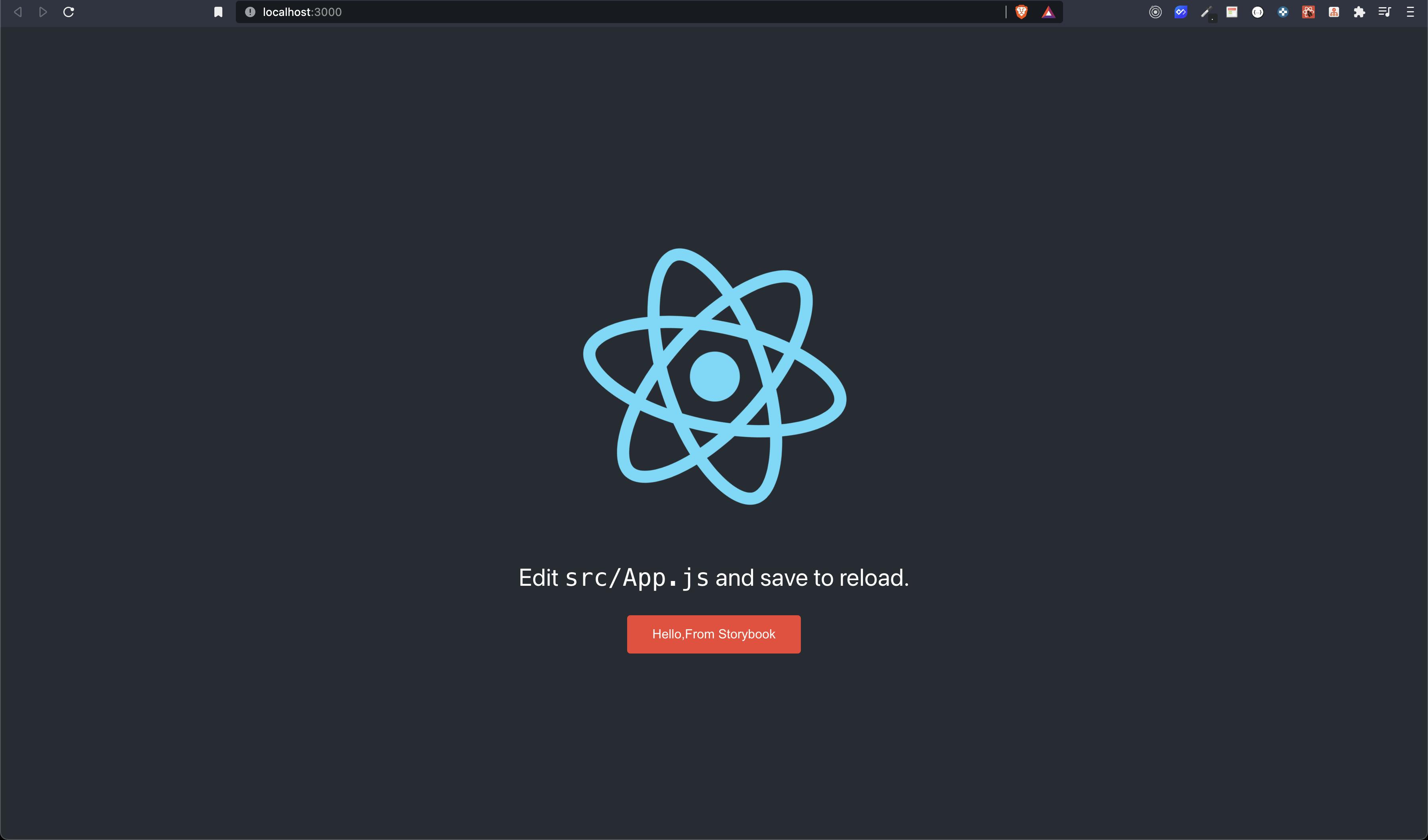
And we have finally created a Button Component also created stories and then used it in the React App.
But But But we have just scratched the surface as I told you there is a lot of things which we can do in a storybook. I would suggest you go to docs that are written pretty well and explore the things as much as you can.
I hope you got familiar with Storybook. Let us meet next time with something new.
Until Then,
Happy Coding. 🙌🏽